
What is Google Material Design?
A single visual language for app UX/UI’s
By Niccolò Maria Menozzi
At Dreamonkey we design web and mobile apps following the guidelines of Google Material Design, but what is it exactly? Let’s have a look together.
«Material Design is a visual language that brings together the classic principles of good design with technological and scientific innovation»
material.io by Google
We get from Google that it is a way of understanding user interfaces: it is a visual language based on classical print elements (letterpress, grids, spaces, proportions, colors and images) transposed in a 2D digital environment.
All these graphic and compositional aspects create and drive the hierarchy and the meaning of the content on the screen, maintaining the user interface coherently regardless of the operating system, the browser and the device (mobile or desktop).
The aim of Material Design is to unify the user UX across different platforms and devices. At the same time it strives to be a flexible basis for innovation and brand identity expression.
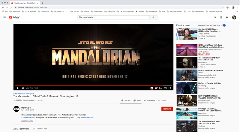
If you are familiar with the Google web services perhaps you already recognise the interface style. Youtube,Gmail, Drive and the Google Docs suite are just a few examples, but there are many others, also among non Google web services.
What is Material Design for?
Material Design is particularly suited for designing the frontend of web or mobile apps, thanks to its evident formal minimalism that caters well to the need to integrate various functions, while maintaining an accessible and intuitive interface.
Material Design is practically a set of guidelines for UX/UI designers and developers. It’s like an extensive instruction manual which explains how to approach the creation of a functional, aesthetically professional digital interface (according to the criteria that are important to Google).
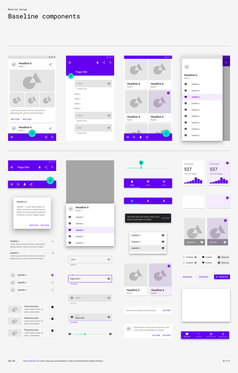
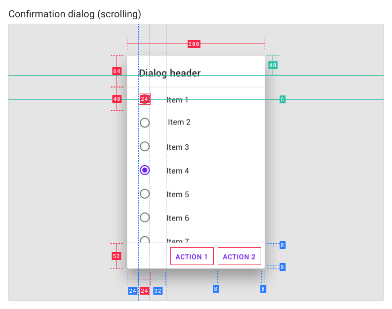
It gives the specifics of a significant number of essential standard components (cards, buttons, lists, chips, etc.) and the principals to follow to personalise or create them.
In a certain sense, adopting Material Design means not having to start from scratch every time you start a new project. Since the basics of the graphic system to be used are already clearly defined, those who are working on the project can concentrate on more important aspects, such as the info architecture, the branding choices (color, fonts, images…) and the creation of personalised components for very specific client needs.
The Material Design interface characteristics
The dedicated Google platform, material.io, offers substantial documentation to gain an in-depth and detailed understanding of all the characteristics of the standard components that populate a Material interface.
If we go beyond the simple graphic aspect to a more conceptual level, Material Design offers a method and logic to organise content.
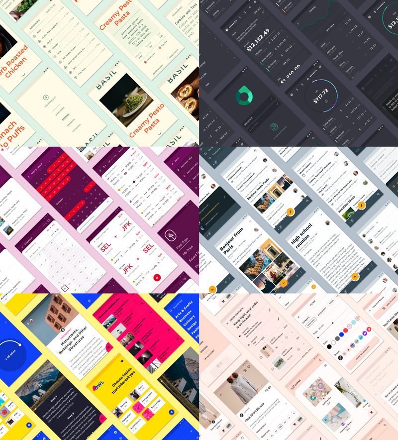
The aesthetic and style fineries can vary – rounded corners, icons, animations etc. – while the fixed element is the criterion adopted to lay out the information and commands.
This criterion offers a framework that preserves the intuitive nature of the user interface regardless of its exterior aspect.
For this reason, despite the apparent decisive graphic cut of the standard components, the Google language maintains a good level of customisation.
Material Design can be personalised
As mentioned, the Material visual language is essentially a list of specifications to develop its standard components, but there is also room for customisation.
The solid and flexible method it was developed with allows designers and developers to assume the guidelines to create consistent and coherent tailor made components, suited to the technical or creative needs of the client.
For this reason, as a collection of directives, Material Design is more of a theoretical reference rather than ready-to-use operative tools.
Even though Google also has libraries of pre-packaged components, designers can freely adopt Material, creating their own components independently to be used both in the prototyping and development phases (by the way, do you know anything about continuity from prototype to software?).
If you want to design a web app or if you want to renew your old software to bring it up to date with contemporary standards, Material Design is probably for you. We are enthusiastic users. Contact us and let’s talk about your next project.